Choosing the right colors for the interior of your home can be difficult. It goes beyond preferring one color over the other. The fact is that colors look different based on many factors, such as the number of coats you use, the sheen, the room lighting, and room surroundings. This post will guide you on how to choose paint colors for home interiors.
6 Strategies for Choosing Interior Paint Colors
1. Gather Inspiration
Before the internet, homeowners often collected ideas by clipping pages from magazines and catalogs, and they are still a good resource today. However, you have access to innumerable pages of online inspiration. Here are some to try:
- Sherwin Williams ColorSnap® Visualizer is available on your smartphone, iPad, or desktop device. We love this tool because you can use their photos or upload your own picture and “paint” the room. You can even toggle between day and night to see how light changes the colors’ appearance.
- Browse hundreds of palettes on Pinterest, or search Pinterest trying different keyphrases such as “interior paint colors” or “interior paint color trends.”
- Take pictures of places you love and create an Instagram palette from your Instagram images. My Insta Palette or Colorkuler are tools that look at the colors you use most in your Instagram photos to create color palettes.
2. Start with Your Furniture and Decor
- Go neutral. Neutral colors match everything.
- Use contrasting colors. Especially if you have boldly-colored furniture, painting the walls in a contrasting color will create a dramatic effect.
- Use the same color, but a darker or lighter shade.
3. Set the Mood
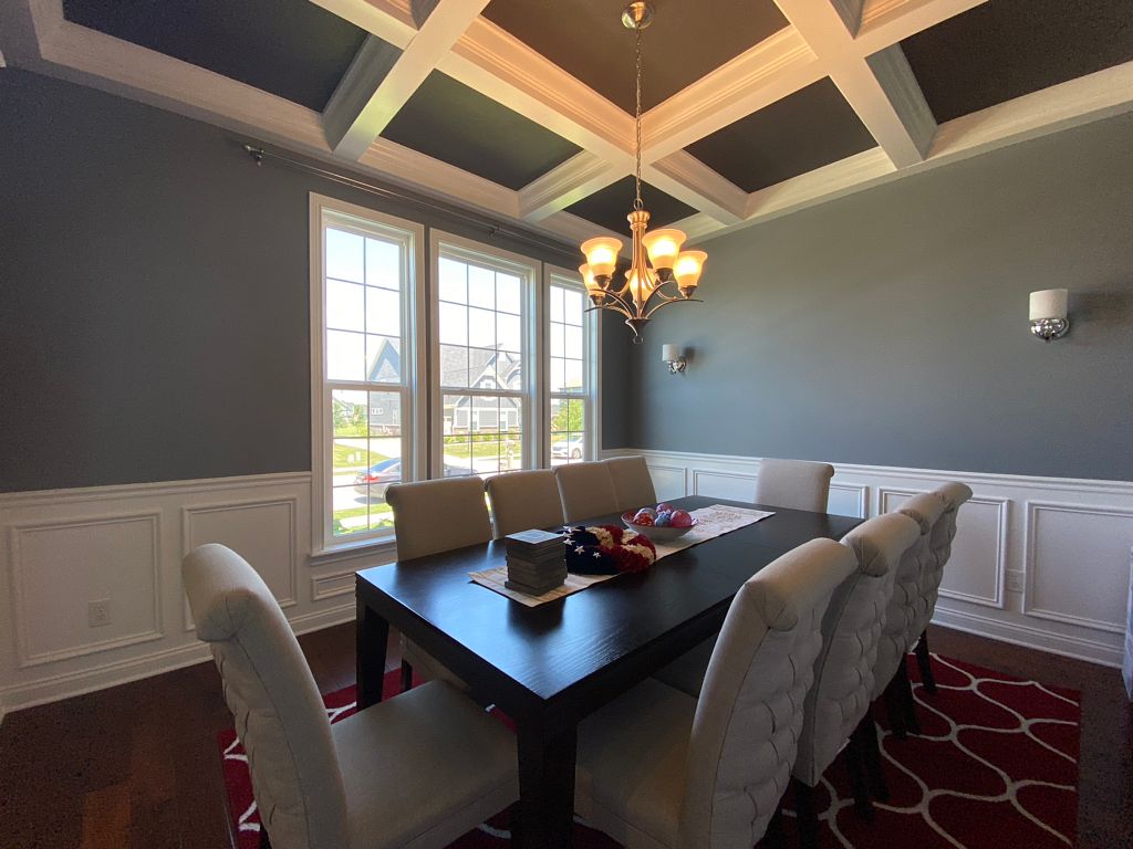
Be mindful that you should use painting techniques with light colors to make a room look bigger. Soft tones will make a smaller space appear brighter and more inviting. Likewise, darker colors that make a room look smaller are best for large rooms. Darker shades absorb more light and also make the big room feel cozier.
4. Select the Right Finish
Most people know to use semi-gloss or high gloss paints in kitchens because the shinier the paint, the more durable and easier it is to clean. But there’s more to choosing the right finish than how easy it is to clean. The look of a room depends on the color and the finish you choose. Here are a few pointers:
- The darker and richer the paint color is, the more sheen it naturally has, so you’ll likely want to choose a lower sheen than if you are using light colors.
- The contrast of matte and sheen in a room can create an eye-catching effect. For example, you could paint the walls with flatter paint and the ceiling with a semi-gloss finish. Or, you may even paint adjacent walls in contrasting finishes.
- A flatter, non-reflective finish can hide any structural imperfections in the walls. A higher sheen finish will reflect more light and is easier to clean but reveals defects.
5. Consider 50 Shades of White
White is surprisingly one of the most debatable colors because people either really love it or think it’s too sterile. Even if you are in the camp that white is too sterile, consider one of the many shades it can be. Here are some tips for using white shades:
- Undertones can make all the difference. To get the right undertone, find a paint swatch that is the same color as a decor color in the room, then look at that color’s lightest shade to find a complementary white.
- Warmer shades of white are best for rooms with low natural light.
- White walls represent purity and elegance, creating a premium background to display decor or a classic painting.
- Showcase vintage furniture against white walls.
6. Stay True to the Times
If you have a historical home, pick interior paint color schemes based on what was popular for the era. Perform a Google search for popular interior paint colors in the year your home was built. Sherwin Williams has a range of historic color palettes and “color through the decades” palettes from the 1830s through the 2010s.
Frequently Asked Questions
What Colors Make a Room Look Brighter?
Choosing a paint color to make a room look brighter can depend on your room furniture and decor. White is a great selection to brighten up a room with bold furnishings. Lighter shades of blue and gray can add light to a room without detracting from your decor, and light orange and yellow shades can add sunny hues to a dark room.
Which Is the Best Color for Interior House Painting?
One color for an entire house interior is generally not recommended, but we realize that you still may need a color that ties rooms together or that covers large areas. Neutral shades will accomplish this quite well. Here are a few favorites:
- Sherwin Williams Alabaster (SW 7008) is a warm white that still brightens up spaces and acts as the perfect canvas for your color accents.
- Sherwin Williams Accessible Beige (SW7036) is a contemporary beige that adds warmth. With gray undertones, it’s more modern looking than the yellowy beige colors of the past.
- Sherwin Williams Colonnade Gray (SW 7641) brings warmth and works in all lighting situations. It won’t pick up any unwanted undertones.
Choosing paint colors doesn’t have to be difficult. We hope we can make it fun. Whether you have exact colors in mind or still need a little help, contact ONiT Painting for accurate estimating, reliable service, and predictable outcomes.