Imagine you’ve secured your perfect home with white walls waiting to get painted. You’ve unearthed every new home owner’s paradise, a blank canvas. And you’re excited to get started as you contemplate “what’s the best color for your bedroom.” At least, until you begin brainstorming decorating ideas and suddenly, color sheets, room themes, and patterned furniture start swimming behind your closed eyelids. You’ve discovered the downward spiral of having “way too many choices” to sort through. Luckily, there are better ways to plan your vision without having to panic pin fifty new boards onto your Pinterest page. This post will cover the best (and the worst) colors to paint your bedroom.
Which Tones Appeal to You?
- What’s the most beautiful color for a bedroom?
- Will I regret it if I pick a bold background?
- What’s the most relaxing color for the eyes?
Cold shades remind us of lulled, comforting coolness. They’re the same palette choice we consider while picking wall colors for summer homes. These tones preserve memories of sea breezes, springs, forest lakes, and soft, rushing rivers. Woods and leathers are great contrasting furniture materials to balance the airiness of cold-toned walls.
Meanwhile, warm tone colors have an entirely different energy when compared to their cold tone cousins. Warm colors embody heat, complimenting the sunshine streaming in through the windows. They’re a “hot chocolate” kind of color, toasty and inviting without having to surrender to the limitations of losing their seasonal flavor. Pairing “warm” colored interiors with pops of different cold tone decor is an excellent way of utilizing the golden undertones in your new walls. And softer furniture materials like velvets, linen, and suede can further compliment the color.
Classic Paint Colors that Never Go Out of Style

Are you looking for some classic paint colors that never go out of style? Try the neutral color wheel, a shade range that welcomes all varieties of textural elements, artwork, and decor for room design.
Subtler, lighter shades have greater popularity for their ability to complement bold, colorful furniture. Tans, grays, whites, beiges, and other neutral colors provide a wide range of warmth and cold. They’re easily interchangeable when inspiration (once again) strikes the avid redecorator. And the paint’s color fade is significantly less noticeable than the fade from brighter colors.
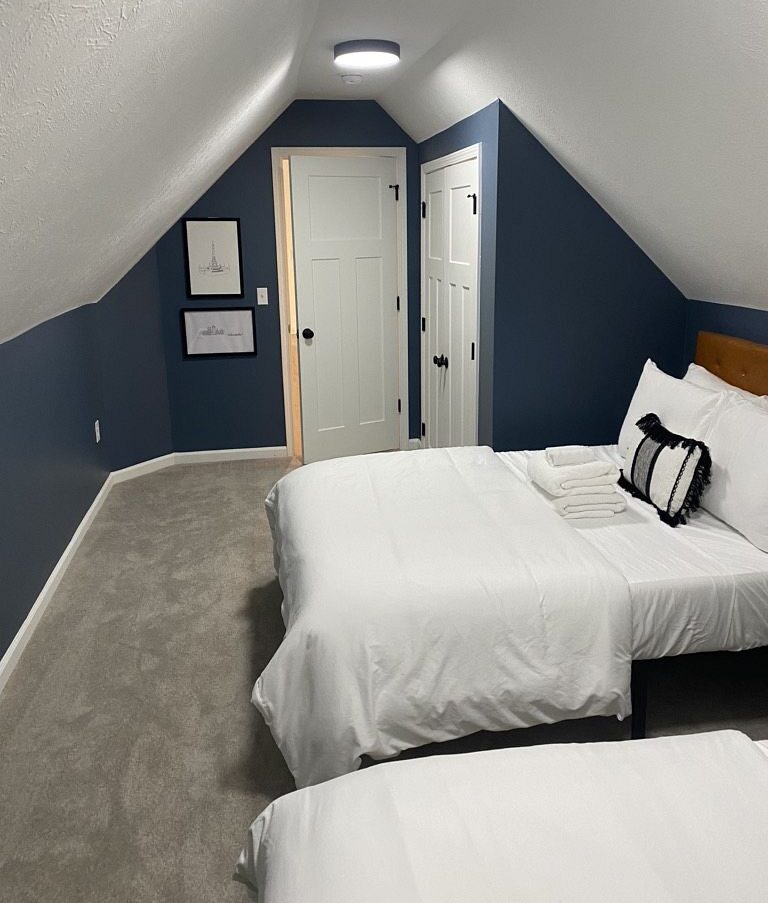
Should I Paint My Room Dark or Light?
You might get stuck on the question, “Should I paint my room dark or light?” while critiquing color combinations. Believe it or not, it’s possible to create a dark bedroom look without resembling the inside of a Himalayan cave. White ceilings, gold/brass knobs, and warmer woods add depth and provide an even contrast to darker walls, especially if they’re cold-toned. Dark bedrooms create a visually smaller, homier look to your space. Some people choose a darker interior for their bedroom to recreate a sense of snugness. Dark colors also contrast fantastically with any given pattern.
Lighter paints have the opposite effect. They make a room look larger, expanding the space into a more expansive “peninsula.” South-facing rooms can be fantastic for light colors as the sun pours into them from a higher point. They’re easy to work with and guaranteed mood improvers throughout any part of the day.
Worst Wall Colors
It’s vital to consider the effects of artificial and natural lighting while picking out shades for each part of your house. Some of the worst wall colors are only the “worst” because they were chosen for the wrong rooms. North-facing rooms give light colors a cooler tint and cause darker colors to look gloomier. Therefore, light cool tone shades are usually a better choice. South-facing rooms brighten bolder colors and heighten warm ones. Be careful when picking something with yellow undertones; it could make the room look overwhelmingly bright. East and west-facing rooms shift from light to cold (and vice versa) according to the sun’s patterns. Neutral colors work well in these areas as they change in tone throughout the day. It’s helpful to test swatches under various lighting before ultimately deciding on a specific shade. Light can have a significant impact on paint.
Whatever you are painting in your home’s interior, you can rely on ONiT for an accurate estimate, reliable service, and predictable outcome. Contact ONiT Painting for an estimate today.