Here at ONiT Painting, we understand that choosing colors can sometimes be the most difficult part of the painting process. Since our goal is to make it easy, we’ve provided a cumulative list of some of our favorite Exterior Color Combinations, so you don’t have to stress over it!
How to Choose Exterior Colors
When choosing colors to paint the exterior of your home, there are a few basic rules to keep in mind. Firstly, you should be choosing 2-3 colors maximum. Anything more than that can appear busy and disjointed.
- Base Color: This should be the “all over” color of your home.
- Trim Color: This color goes on all of the trim and woodwork.
- Accent Color: This varies greatly from home to home, and isn’t always necessary. Most commonly, accent colors are used on the front door and shutters.
Secondly, it is important to keep in mind that the same color will appear much lighter on the exterior of a home than it would on the interior. Since exteriors receive a lot of direct sunlight, you don’t want your colors to appear washed out. If you like a color on the interior of the house, we recommend going 1-2 shades darker for the exterior.
Sherwin-Williams Color Snap Visualizer
All of the photos used in this blog were created with Sherwin-Williams ColorSnap Visualizer! This is a remarkable tool that allows you to visualize colors and how they look together right on your phone or computer. You can choose to test colors on their stock images, like we have done below, or take a picture of your own home!
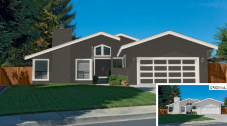
Gray
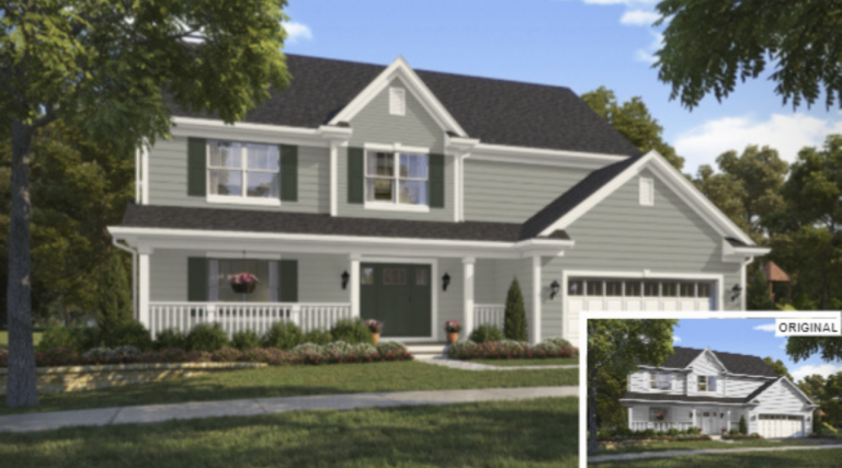
Base Color
SW 6199 Rare Gray makes a beautiful gray base exterior color for your home. The slight green undertone of this paint color will stop the sunlight from making it appear blue or purple.
Trim
Since rare gray has an LRV of 38, making it a mid-toned gray, you can get away with a cream color on the trim, as opposed to a stark white look. We’ve found that SW 7551 Greek Villa is a great pairing. With an LRV (light reflective value) of 84, it will contrast the base color beautifully, without looking too harsh.
Accent Color
We highly suggest choosing an accent color that accentuates the green undertones in rare gray, like SW 7749 Laurel Woods. This is an extremely deep green with an LRV of 6. It will really draw the eye to the front door while creating a cohesive overall exterior look.
White
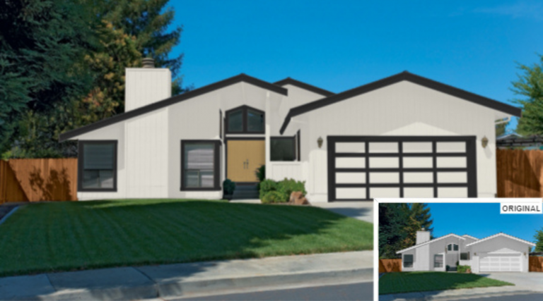
Base Color
When choosing a white base color, it is very important to make sure it isn’t too bright. Stark whites can appear almost blinding on the exterior, and make the home appear very cold. We recommend SW7008 Alabaster for a white base exterior color. It has an undetectable hint of yellowish cream that will keep it from looking harsh and sterile.
Accent Color
A natural wood or very warm tan front door would be ideal to build on the modern style we already have going. If you do not already have a natural wood-toned door that you like, we suggest SW0043 Peristyle Brass.
Red
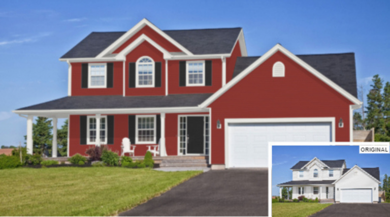
Base Color
When choosing a red exterior color it is very important to keep the effect of the sun in mind. Bright sunlight can make a normal, cherry red color appear pink, and usually isn’t the vibe that customers are looking for. We recommend choosing a burgundy-red color with blue undertones such as SW7600 Bolero.
Trim Color
Since we are choosing a red color with blue undertones, it is safe to go slightly cool-toned with your trim color. Despite it’s name, SW7005 Pure White is actually an off-white color. It has a slight gray undertone but is still warm enough that it won’t appear silver or blue.
Accent Color
SW6991 Black Magic would be our top accent color choice. It has the same LRV as Tricorn black, making it a true black color. However, Black Magic has just a touch more red in it, which perfectly compliments the base color Bolero.
Green
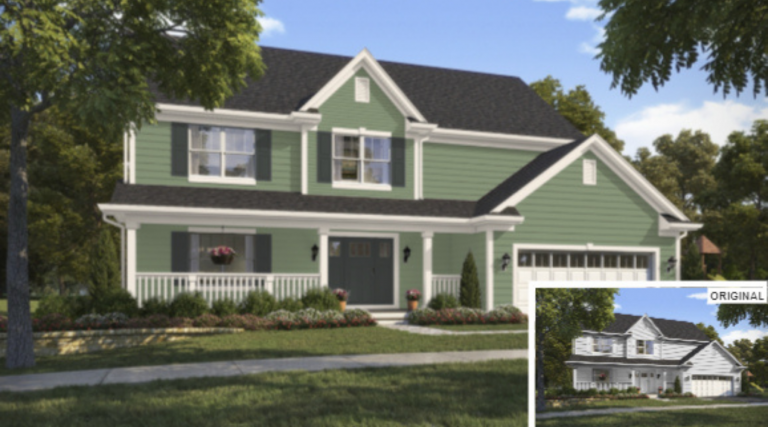
Base Color
2021 has been the year of green! People are incorporating green in all aspects of their home, but especially the exterior! We love the look of SW9674 Leaflet as a base exterior color. This sage green color is very trendy right now and gives any home an inviting cottage feel.
Trim Color
SW7104 Cotton White is a wonderful pairing for Leaflet. Much like Alabaster, it is definitely a warm-toned white but gives off a bright feeling when used on the exterior.
Accent Color
You could really go a number of directions with your accent color on this one. If you’re looking for a more quaint “cottagecore” look, you could choose something light like a buttery yellow. However, we think that using a deep charcoal gray like SW 7062 Rock Bottom achieves a beautiful balance of modern and classic styles.
Bronze
Base Color
It would simply be wrong if we didn’t mention Sherwin-Williams 2021 color of the year, SW7048 Urbane Bronze. This is an extremely dark taupe color with an LRV of 8, making it the darkest base exterior color we will be mentioning today. It is a bold choice but is guaranteed to make your home stand out from the rest. The intense brown undertone of this color gives off serene and earthy vibes, which everyone is going for this year.
Trim Color
With a color as deep as Urbane Bronze, a cream trim color makes the most sense. SW7042 Shoji White is a stunning neutral cream color. It is a warm color with an ever-so-slight green hue to it, which perfectly compliments Urbane Bronze.
Accent Color
Keeping with the dark and moody theme, We’re revisiting Tricorn black. This time, however, as an accent color. We are seeing Urbane Bronze paired with black a lot this year, and loving the industrial-chic look it gives off.
Navy
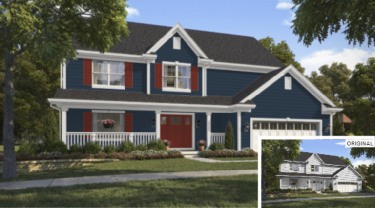
Base Color
SW6244 Naval was Sherwin-Williams 2020 color of the year. However, we have not seen the last of it! People are still loving this deep navy color in all areas of the home. As an exterior color, it adds charm and character to any home.
Trim Color
Much like Urbane Bronze, you can get away with a darker trim color when pairing it with Naval. The LRV’s are still so far apart that it provides the interesting contrast you need from a trim paint. SW6000 Snowfall is actually an extremely light gray color which pairs perfectly with a deep blue like Naval.
Accent Color
For this style, we chose a deep brick red for the accent color. Specifically, SW7593 Rustic Red. This combination of colors gives an exciting twist on the classic red white and blue color scheme.
Beige
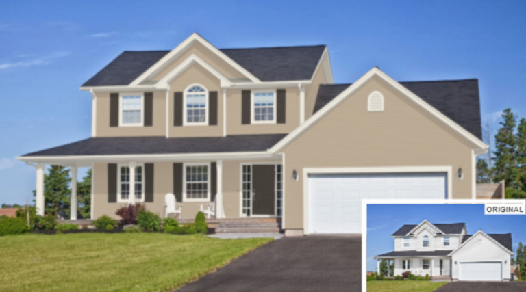
Base Color
We’ve mentioned a lot of bold colors so far, but don’t fret! Here’s a lovely neutral combination perfect for anyone wanting to stick to the classics. The base exterior color is SW7530 Barcelona Beige. It is slightly warm but appears neutral on the exterior.
Trim Color
SW7566 Westhighland White is the perfect warm cream color to pair with Barcelona Beige. It definitely has a yellow undertone, so is not the choice for someone wanting stark white-looking trim.
Accent Color
Since we’re keeping this one clean and simple, we went with SW7020 Black Fox for the accent color. However, it is not a true black, like the name suggests. It is a very deep neutral gray which will play nicely with the neutral undertone of Barcelona Beige.
Ready to try one of these color combinations on your home? Schedule a free in-person or virtual estimate with ONiT Painting today!