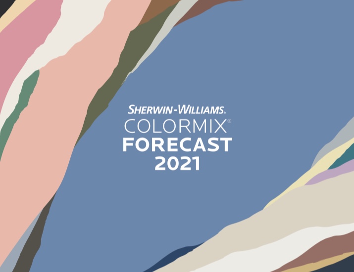
It is that time of year again! The holidays are just around the corner. Everyone is reflecting on the year we’ve had, and looking forward to the year to come. It’s around this time of year that most big-name painting companies release a color palette reflecting their predicted color trends for the next year. However, Sherwin-Williams went above and beyond and released four palettes, all a part of their Colormix Forecast 2021 Collection. We are here to give our opinion, as professional painters, on the palettes they have chosen and our favorite color from each.
Sanctuary
“Nature’s ability to cultivate wellness and calm is more welcome than ever. The nurturing hues of this palette, including warm neutrals and natural tones, forge the connection between the modern built environment and the living world” (Sherwin-Williams).
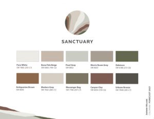
This palette is the most neutral of the Colormix Forecast 2021 Collection. It really focuses on colors drawn from nature, such as redish browns and mossy greens, in an attempt to provide a warm and comforting space. We think that it achieves this goal beautifully. Let’s discuss our standout color from this palette.
Standout Color: Urbane Bronze
This color is actually Sherwin-William’s 2021 Color of the Year. It is extremely dark, which makes it a powerful choice. However, the warmth of this color helps keep it from getting too overwhelming. It would look wonderful as an accent wall or cabinet color.
Encounter
“Layers of local character — rooted in culture and artisan craft — create an authentic sense of place. The rich but muted hues in this palette convey that heritage quality and the value of simple, meaningful experiences” (Sherwin-Williams).
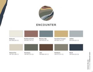
Encounter is much more colorful than sanctuary in that it includes yellows, blues, and reds. However, they are very soft and not vibrant. This makes it much easier to incorporate such colors in your home, without taking over the entire space. As the description stated, the palette evokes a sense of craftsmanship and culture. These colors can be easily found in pottery, beadwork, and woven crafts.
Standout Color: Tarnished Trumpet
Despite being yellow, this color is surprisingly versatile. It is muted enough that you could get away with painting the whole room with it. Paired with neutral/cream furniture, mixed texture décor, and natural wood tones, it could add a huge wow-factor to your home, without being overwhelming.
Continuum
“The optimism and imagination of mid-century modernists inspired designs that reached high into the sky and deep into the sea. This palette of white, charcoal and pops of color celebrates that spirit as it bounds fearlessly into the future” (Sherwin-Williams).
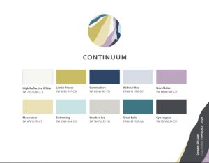
Everything we said about muted colors in Encounter is thrown out of the window with this palette. It includes bright, rich colors that are not for the faint of heart. However, what Sherwin-Williams did right is include light and cool neutral colors to compliment all of the vibrant colors of this pallet. Continuum draws from nature, much like the rest of the Colormix Forecast 2021 collection, but not from earthy tones. For this palette we turn to the water, and colors that you would find in the ocean and it’s sea life.
Standout Color: Swimming
This charming light blue color instantly brightens up any space. It has an airy quality to it, which makes it extremely inviting, despite being such a bright color. It would work beautifully in a bathroom or nursery.
Tapestry
“Exuberance meets restraint in today’s more curated take on maximalism. The vibrancy of this palette — including lavish pinks and greens — finds inspiration in classicism, but with just a touch of cutting edge” (Sherwin-Williams).
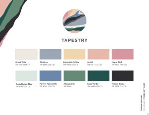
Tapestry takes continuum up a notch with it’s array of colors. It is packed with vibrant show-stoppers that will turn your guests’ heads. Looking at this palette creates the same feeling as walking through the modern art exhibit at a museum. It is daring, but classy, and perfect for those with a creative heart. It may be overwhelming for some to look at this palette as a whole. If this is the case, try looking at each color individually. When paired with a neutral paint color, any of these colors could add a wonderful accent to your home.
Standout Color: Jaipur Pink
Although pink isn’t for everyone, if you are a pink lover this should be your new favorite paint. It has much more sophistication and richness than a classic bubblegum. Much like the other colors in the Tapestry palette, it would add a unique and dynamic element when used as an accent in any room.
Think you might be interested in bringing one of the palettes from the Sherwin-Williams Colormix Forecast 2021 into your home? Schedule your free in-person or virtual estimate with ONiT Painting today!